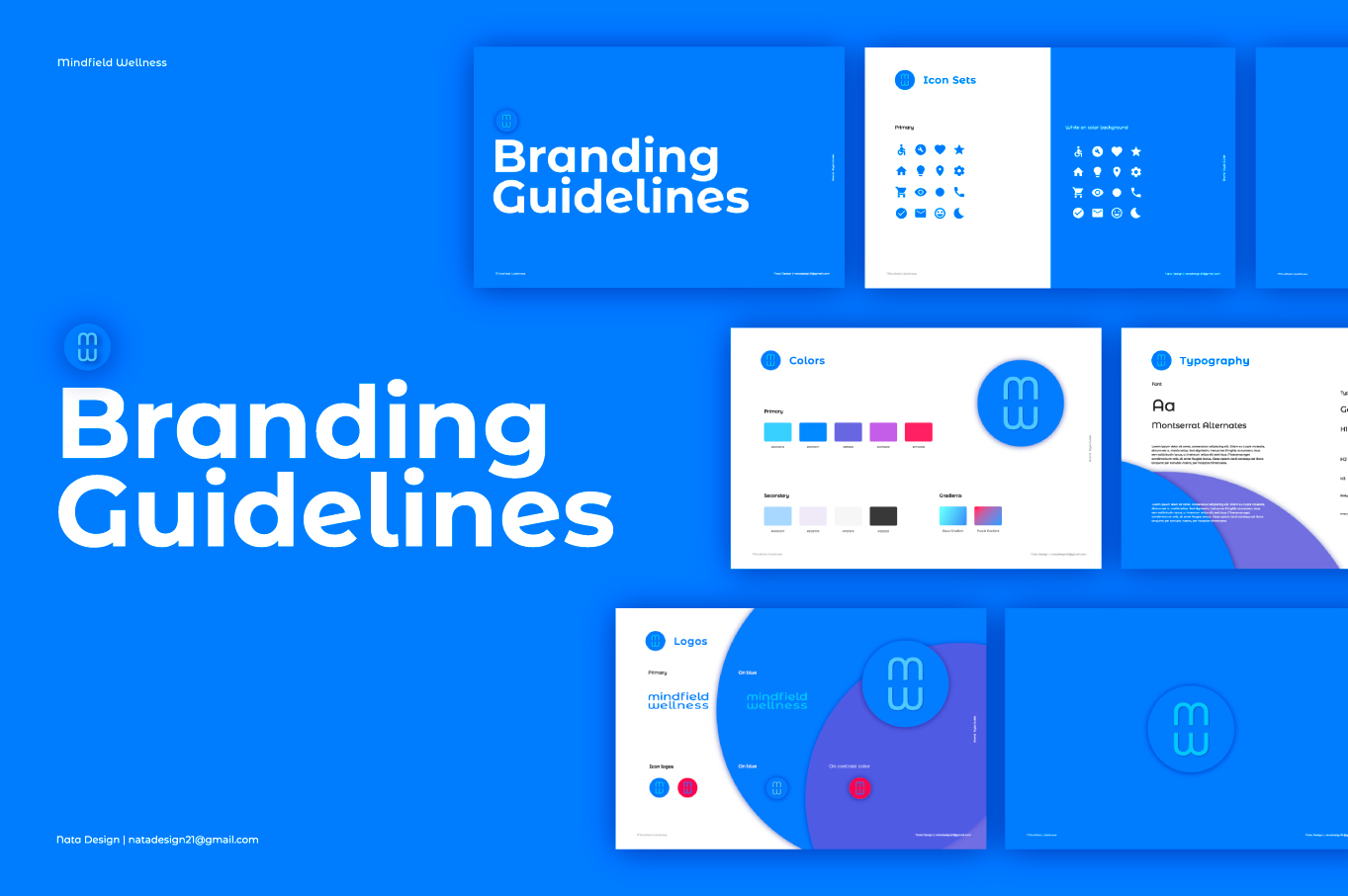
Mindfield Wellness
reBrand 2025
- International client
- Branding and logo design
- Visual Identity design
Mindfield Wellness is a cutting-edge provider of ketamine infusion therapy, offering a revolutionary approach to mental health treatment in the comfort of your own home. Based in Los Angeles, Mindfield Wellness stands at the forefront of innovative, medically supervised ketamine treatments, designed to help individuals struggling with severe mental health conditions such as depression, anxiety, PTSD, and chronic pain.
As part of our mission to make this life-changing therapy more accessible, we are introducing a new branding initiative, set to launch next year, that reflects our core values of approachability, compassion, and professionalism. This fresh identity is crafted to foster a welcoming environment for our patients, ensuring they feel supported and cared for throughout their healing journey. We aim to combine state-of-the-art medical expertise with a friendly, personalized touch, creating a trusted space where individuals can find relief from the challenges of mental health disorders.
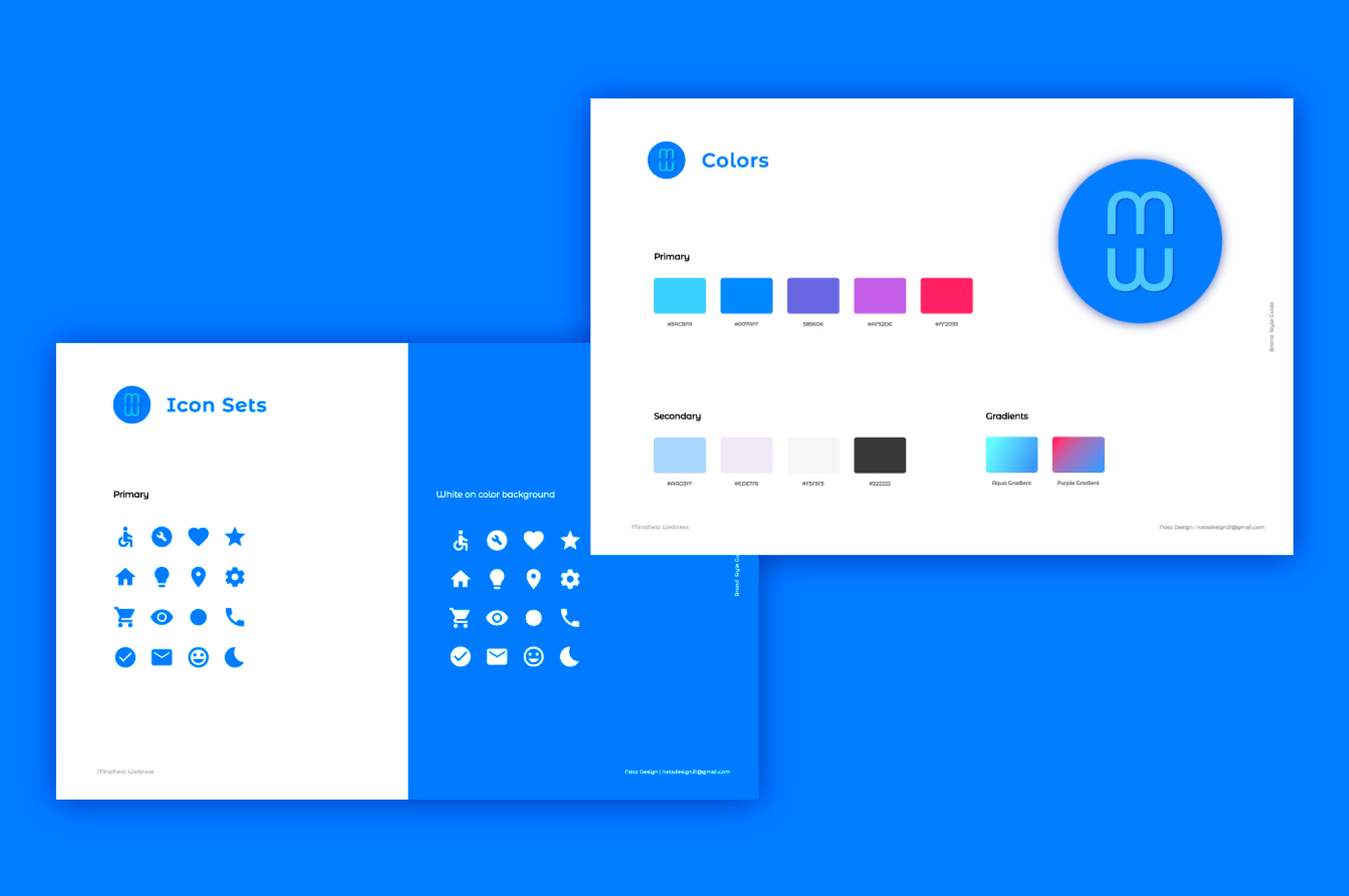
The color palette for Mindfield Wellness was thoughtfully curated to evoke a sense of calm, professionalism, and trust. The primary colors, ranging from shades of blue to purple and red, provide a vibrant yet soothing visual experience. Blue, often associated with trust and reliability, forms the foundation of the brand’s identity, making patients feel secure and supported. The gradient options, such as the “Blue Gradient” and “Purple Gradient,” add a dynamic touch, symbolizing the transformative journey of healing and wellness that patients undergo.
The secondary colors, featuring soft pastels and neutral tones, complement the primary palette, adding balance and versatility to the design. These lighter tones provide contrast and help emphasize key information without overwhelming the viewer, creating an inviting and approachable atmosphere.
The icon set, designed in clean, minimalist shapes, reinforces the brand’s modern yet approachable nature. The primary icons, featuring universally recognized symbols, are simple yet effective in their communication. When placed against the blue backgrounds, the white icons stand out clearly, ensuring they remain legible and easy to interpret. The consistent style across the iconography helps to build a cohesive visual language, further enhancing the accessibility and user-friendliness of the brand experience.
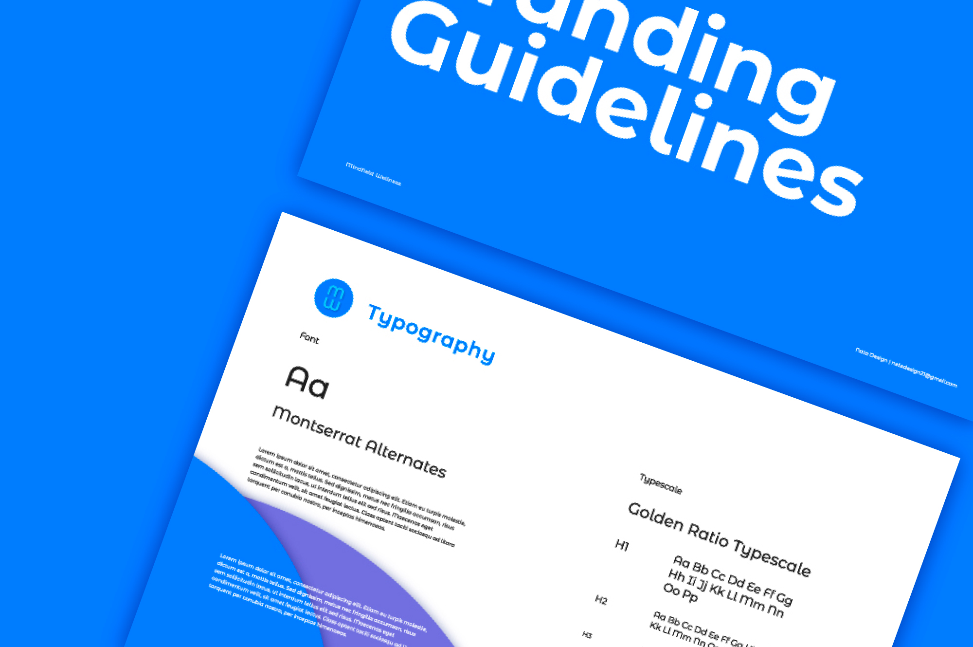
The choice of typography, Montserrat Alternates, plays a crucial role in reflecting the approachable and welcoming character of the Mindfield Wellness brand. Montserrat Alternates, with its soft curves and contemporary structure, strikes a perfect balance between modernity and warmth, reinforcing the brand’s goal of creating a sense of ease and openness for individuals who may be navigating the complexities of mental health. The subtle yet elegant shapes of the font convey a message of trust and support, allowing patients to feel at ease from their very first interaction with the brand.
The use of the Golden Ratio Typescale further enhances the design’s visual impact. This timeless mathematical principle, renowned for its balance and harmony, has been applied to establish a clear and intuitive visual hierarchy throughout all brand materials. By adhering to the Golden Ratio, we ensure that the typography not only looks aesthetically pleasing but also effectively guides the viewer’s eye through key information. This precision in typesetting enhances readability and accessibility, ensuring that our audience can easily engage with and understand the vital information presented. Ultimately, the combination of Montserrat Alternates and the Golden Ratio Typescale creates a design that is as approachable and friendly as it is professional and reliable.